At last, we have come to the concluding section of our three part series on Nile flooding! The first blog in this series discussed when the inundation occurred together with a brief discussion of how this impacted life in Pharaonic Egypt, while the following section examined nilometers, since they were used to recording the height of Nile floods for nearly 5000 years, between about 3000 BCE and the construction of the Aswan High Dam in 1958 CE. The robust data set from Roda in particular is useful for mapping flooding over the course of over 1300 years, from about 622-1958 time.
This week, we will explore how to represent this data spatially, and the implications some of these findings have for our project. It should be stated from the outset that this work would be impossible without the efforts of scholars working in a variety of different sub-fields: the translation of the data recorded by the Roda nilometer was painstakingly accomplished and interpreted by scholars like Omar Toussoun and William Popper, with notable later contributions by Stephan Seidlmayer who also incorporated archaeological evidence from Elephantine. The elegant QGIS software plugin used to model this data spatially was developed by the geographer Ute Susanne Kaden. It is an illustration of the value of interdisciplinary collaboration, and we are very fortunate that such a collegial, inquisitive, and rigorous scholastic atmosphere is fostered by our colleagues at the Polish Academy of Sciences.
Our first step was to rather laboriously enter all of the readings from the Roda nilometer into a spreadsheet, including the year number, the measurement in cubits, and for later periods, headings for the absolute maxima and minima in meters above sea level at Aswan. After the introduction of water gauges, 10 day averages of the maximum and minimum Nile heights at Aswan were also entered.
The key point here is that we can relate the measurements in cubits at Roda to absolute measurements from 1871 onwards. Following Seidlmayer, we can use a simple linear regression to construct a best-fit line to correlate cubit measurements from Roda to an absolute value in meters above sea level. In our case, this equation is as follows: The reconstructed height at Aswan (A)= (the Roda measurement (R)+95.75)/1.240388 or A=(R+95.75)/1.240388. This proved extremely accurate from 1871-1958 save in cases of exceptionally high floods. From this, we could derive a recalculated estimate of maximum flood heights from 622-1958! You can see a plot of this variation included in the chart below.
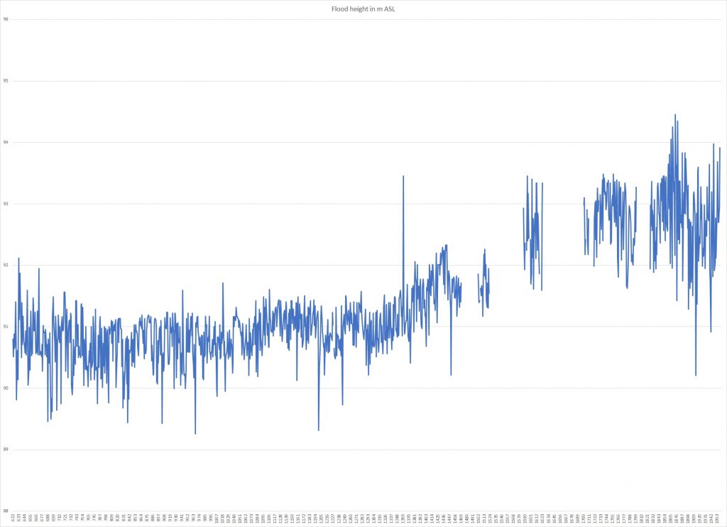
Several conclusions are quickly apparent from this graph. First, it seems clear that average Nile heights rose almost two meters from roughly 1400-1900. This is crucial to remember—this historical data corroborates archaeological data from Elephantine island that suggests that average flood heights could fluctuate significantly over various temporal intervals. The Middle Ages generally had lower floods than the Early Modern Period. However, high floods occurred even during periods of relative drought, while catastrophic droughts might still emerge even in periods with higher average flood heights.
In our case, archaeological evidence at Elephantine suggests that Nile heights approached roughly 94-94.5 m during the First Dynasty, suggesting that the founding of the Pharaonic state occurred during a period of very high Nile floods. This flood level declined gradually over the course of the Early Dynastic Period and Old Kingdom, to a minimum of about 91.2-91.7 m during the First Intermediate Period—a figure roughly comparable to the first 750 years of floods documented in this chart from 622-1372 CE.
Representing this Flood Data in a GIS
The ability to represent this data visually depends on having access to a Digital Elevation Model, an important element of spatial analysis that we previously discussed. In our case, we used freely available LandSAT/SRTM data. As you’ll recall, each pixel within this DEM is assigned an elevation value. Using tools within QGIS, it is a fairly simple process to create a new raster from this data that colors in every square below a height of, say, 94 m ASL. This shows the areas within the modern landscape that would be flooded by an inundation reaching this height. Using similar calculations, we can estimate the Nile’s low water level at roughly 86 m. Check out the results below!
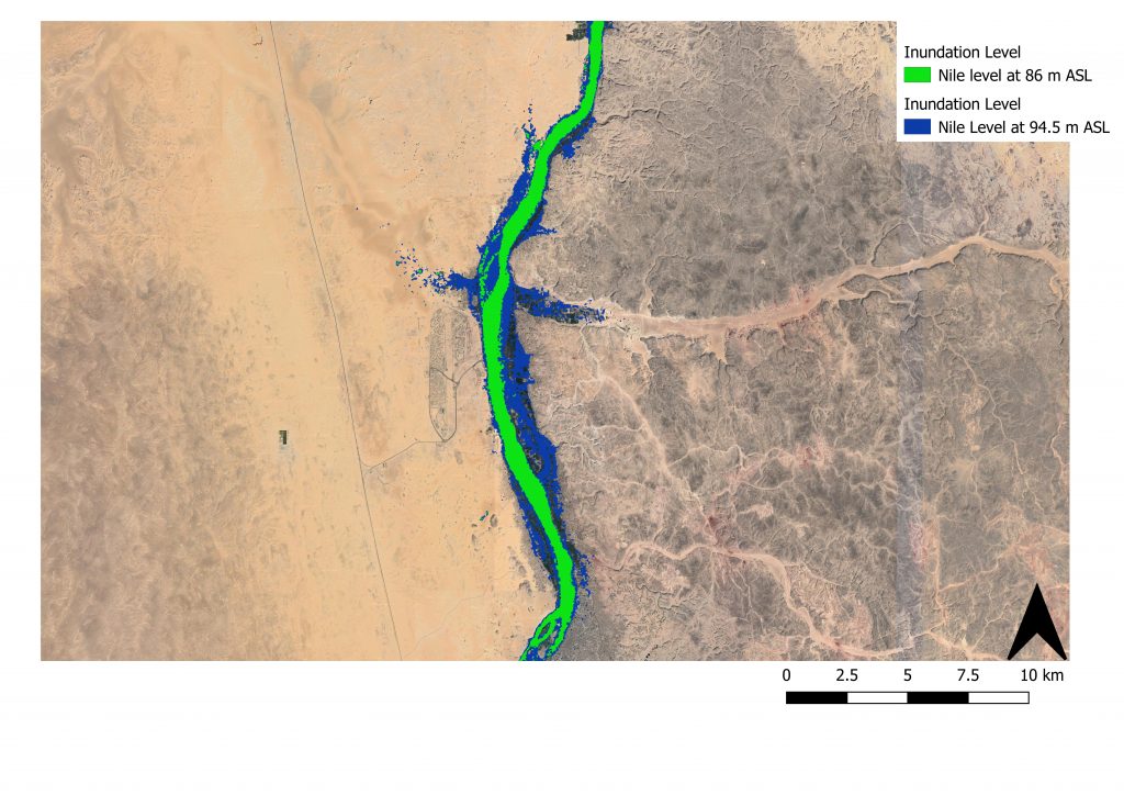
By looking at the difference between the dark blue and green colors, you can see which areas would have been inundated (and thus might have served as quality farmland if the area wasn’t too swampy). During the flood, such areas might also be more easily reachable by boat. Finally, we can see that the Nile flood created numerous geziras, or turtlebacks, that were once again accessible by land during the harvest. Water also extended into the mouths of certain deeper set wadis. These islands and wadis were often ideal places for settlements, as we shall see in future blog posts. In many cases, we know from excavations or drill cores that some of these spots that look like they might have been ancient islands almost certainly were during the periods prior to the extensive damming of the Nile at the First Cataract.
Incorporating the mass of nilometer readings we discussed above is slightly more challenging but led to equally intriguing results. We were very fortunate to find a QGIS plug-in designed by Ukki Kaden to model how frequently different areas of a floodplain were inundated using data from water gauges. Because neither Maria nor myself are expert coders, she was kind enough to help us better understand how to input our data into a plug-in designed for daily water readings. Nonetheless, we were able to use this excellent plug-in to model our flood data from 622-1911 CE. You can see the results below!
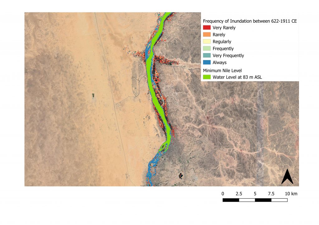
This distribution helps to visualize which areas were regularly flooded, and which areas were only flooded during extreme circumstances. In many respects, the results are comparable to the example above from the raster calculations we discussed earlier. However, the inundation calculator helps to clarify which parts of the floodplain were especially marginal, and which were regularly inundated. Moreover, it is worth highlighting how the data from 622-1911 seems to be almost the inverse of our own dataset, where the expansion of the settlement at Elephantine suggests that maximum flood levels decreased from highs of about 94-94.5 m in the late Predynastic and 1st Dynasty to about 91 m in the First Intermediate Period, after which written records suggest flood levels increased once more.
There are many difficulties related to this visualization of flood data beyond discrepancies in the translations or accuracy of Nilometer readings. Most prominently, the Nile valley declines slowly from south to North, so the absolute elevation of Edfu is considerably lower than Elephantine. For this reason, our results are less accurate the further North one travels, and we are exploring ways of accounting for these changes in elevation. The variable topography of the First Cataract region also makes readings south of Elephantine less accurate. We are still playing around with different ways to manipulate this data, but as I hope you can see from the results above, it has already led to promising insights and corroborated much existing archaeological data.